Hannah Wilson
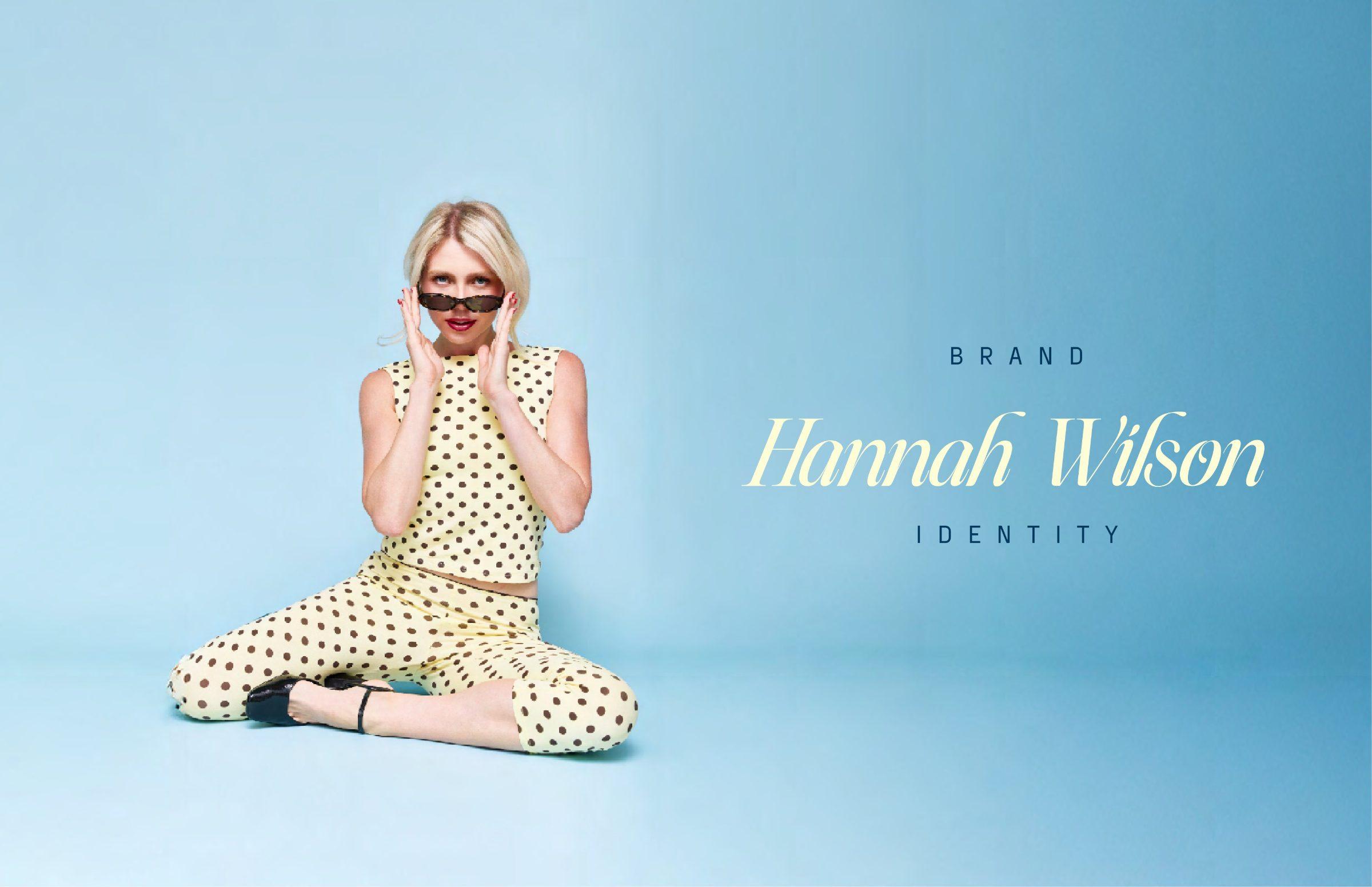
Hannah Wilson a personal brand built like a product: fun, elegant, bold, and impossible to mistake.
The business problem
Hannah teaches people to build their personal brands, for an audience of around a million. Her own content had to prove the point: recognizable at a glance, whoever makes the post.
She arrived with everything laid out: what she wanted, what she didn't, and the references to back it. Driven, quick, thorough. A brief like that lets design go straight to the point.
The question
What if the brand wasn't a logo, but a set of rules anyone on her team could follow?
What we did
01 · The anatomy
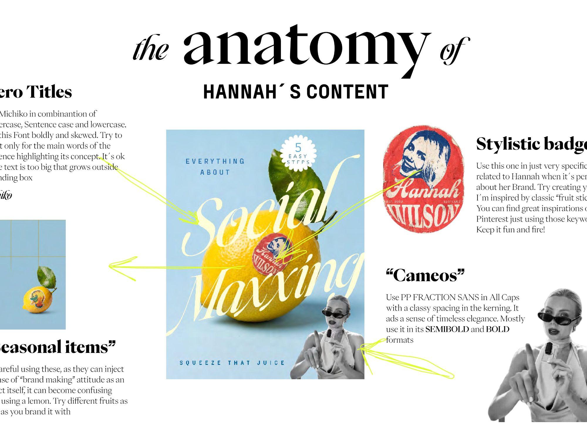
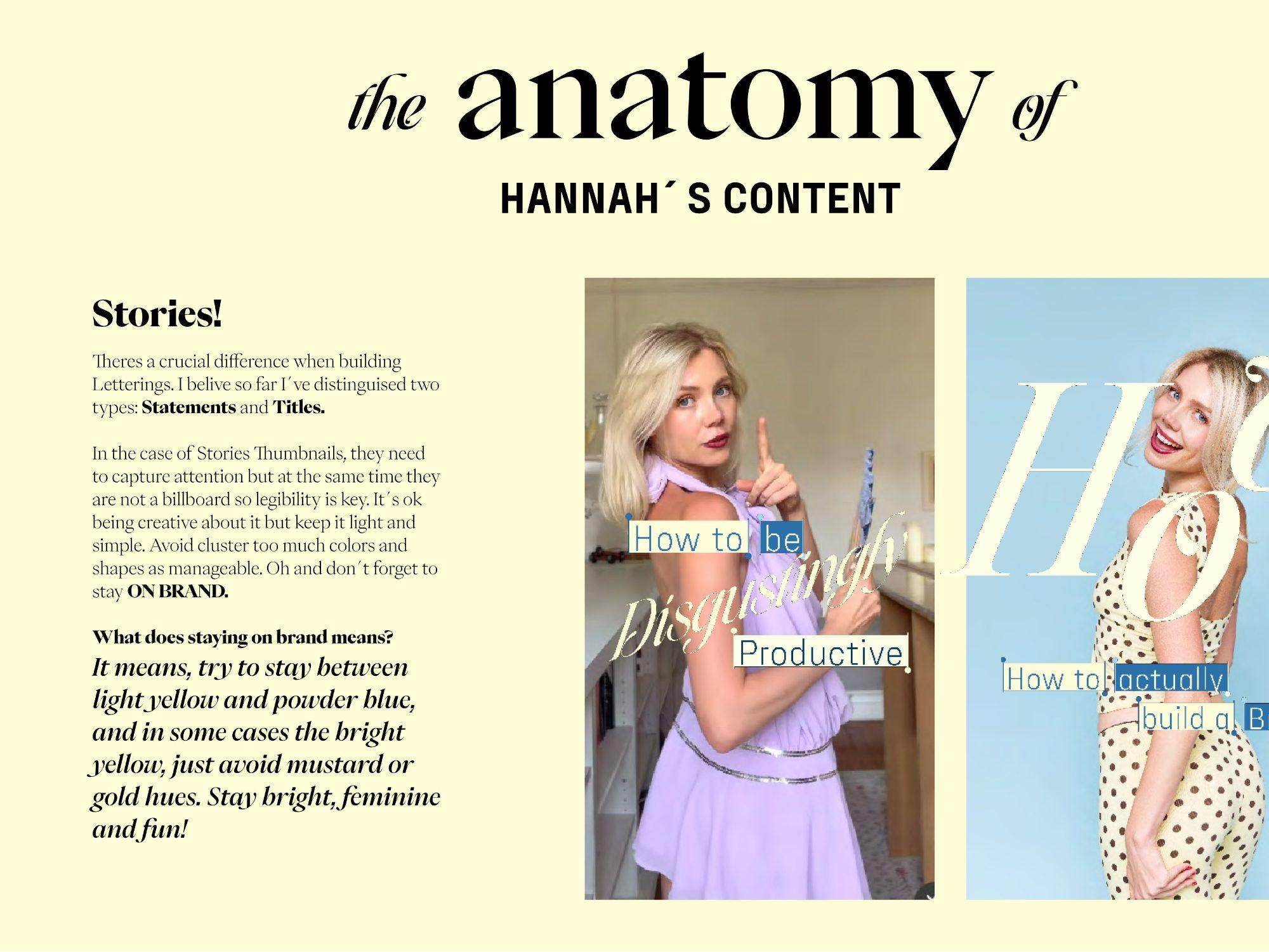
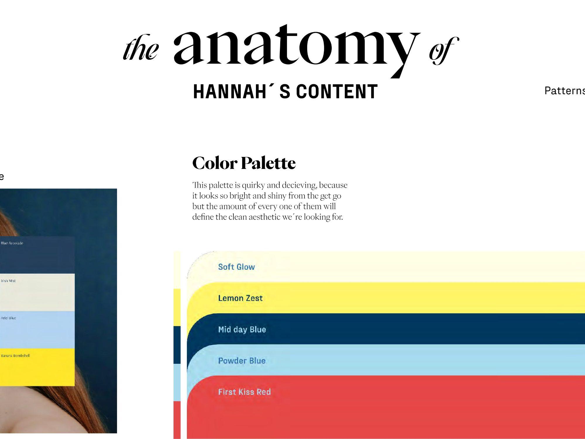
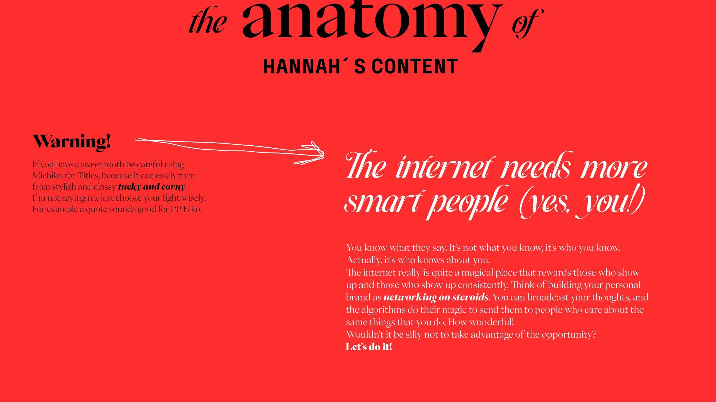
A guide called the anatomy of Hannah's content: hero titles in Michiko, bold and skewed; subtitles and punchlines in PP Fraktion Sans; body text in PP Eiko.
02 · The palette
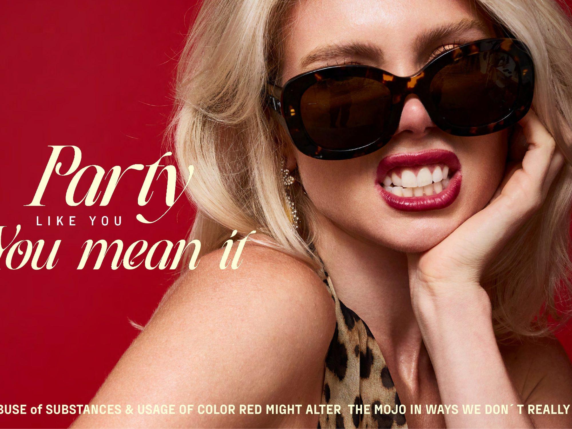
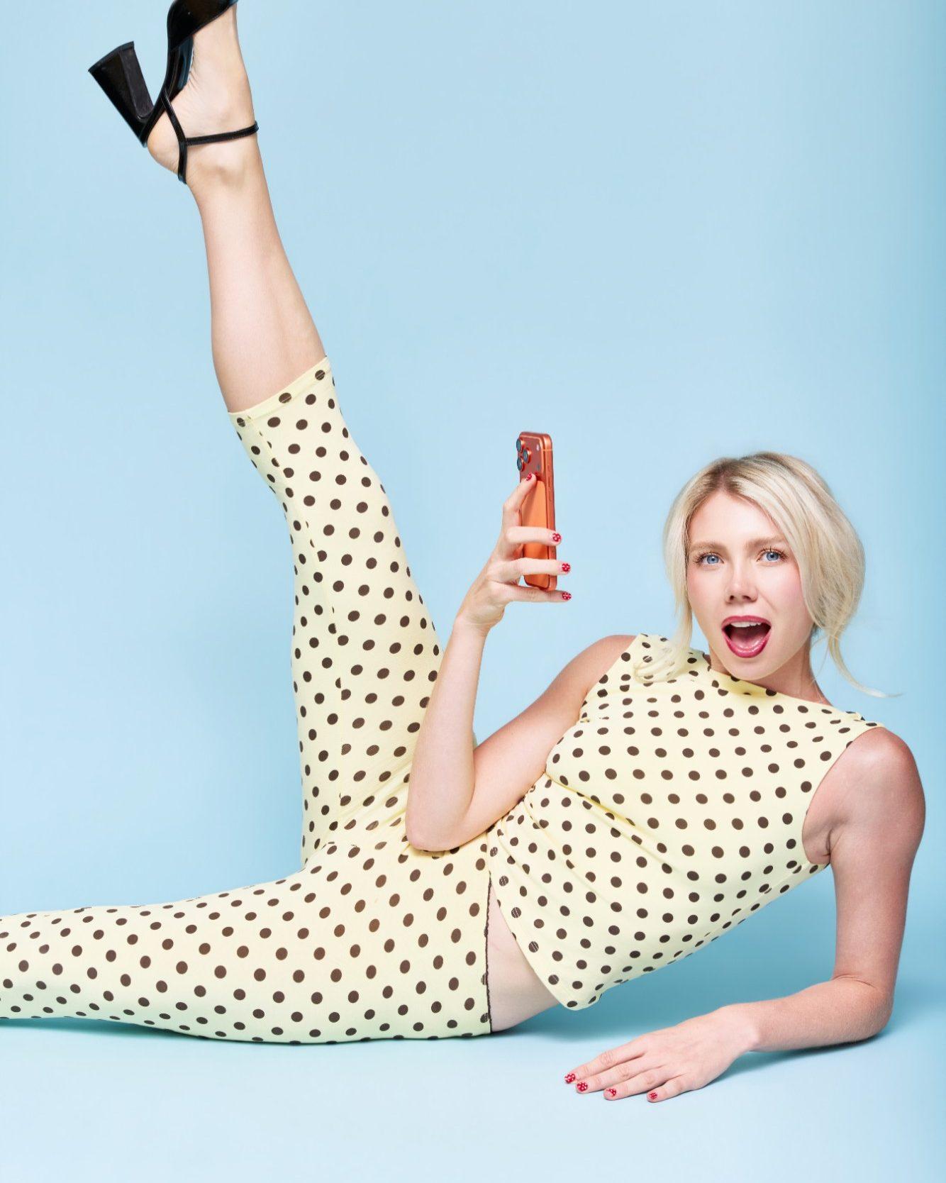
Light yellow and powder blue, bright yellow in small doses, never mustard or gold. And red with measure: too much of it alters the mojo.
03 · The props
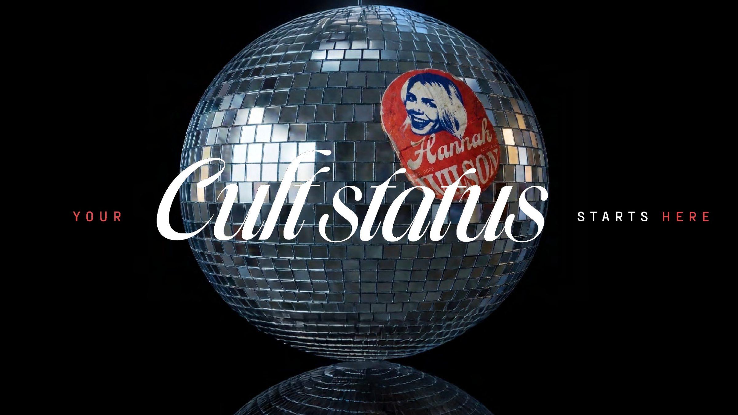
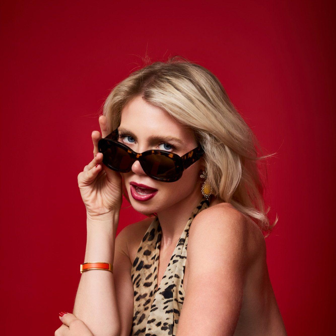
Seasonal fruit, cameo portraits, a disco ball, polka dots. The question behind every layout: what would '50s advertising look like in 2030?
04 · The badge
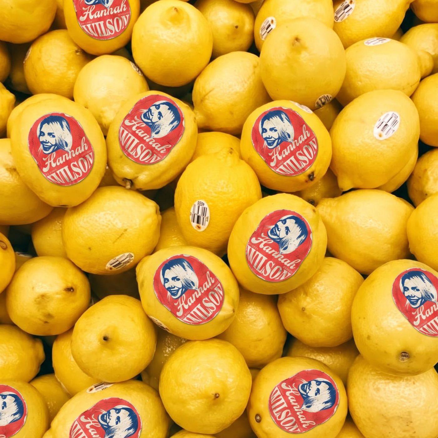
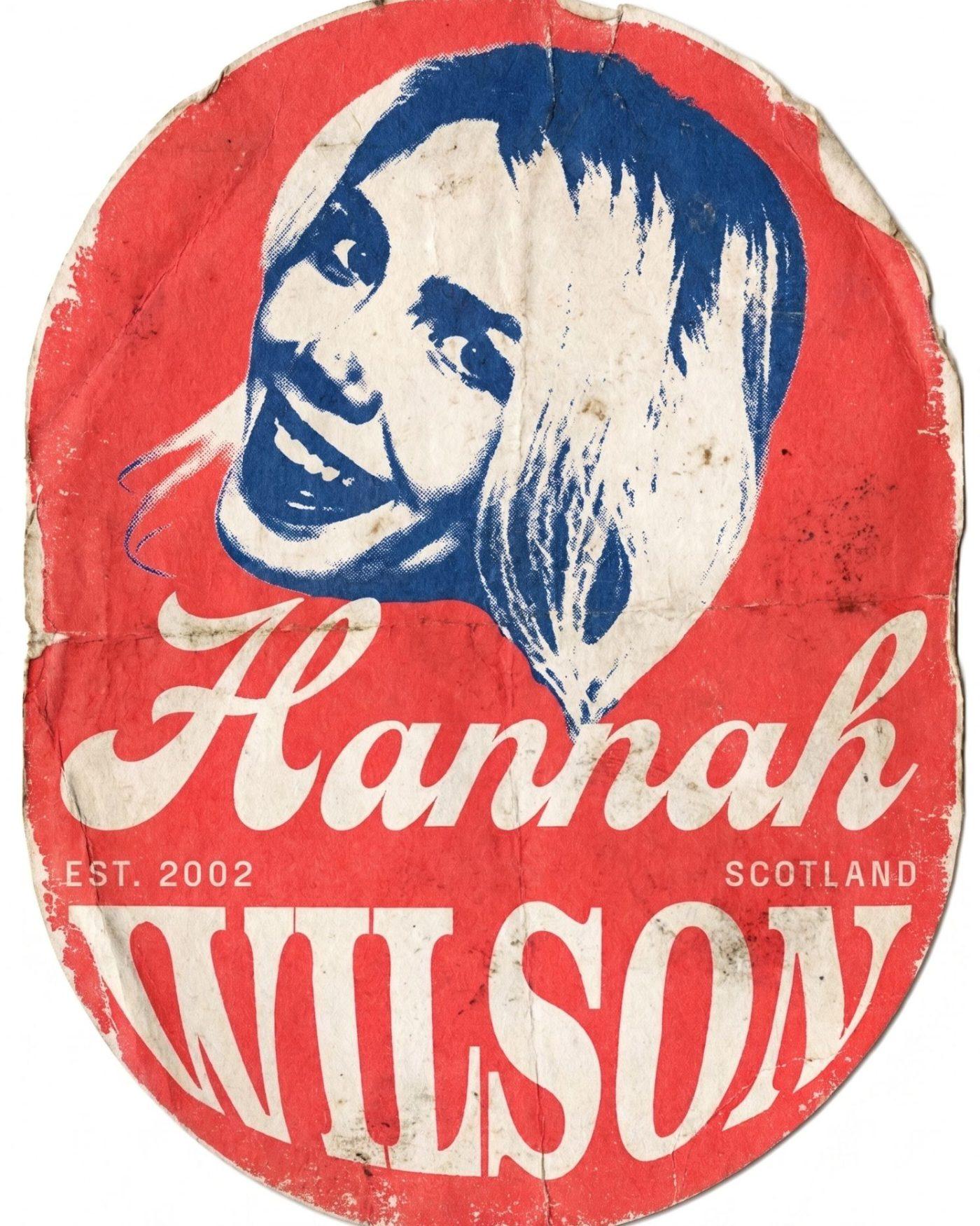
A stylistic badge drawn like a classic fruit sticker, for the moments that are personal or about the brand itself.
The work
Brand identity · Content system · Art direction · Brand guidelines
The insight
The fruit sticker became the signature. A brand stamped on everyday things, the way a good personal brand shows up where you don't expect it.
The outcome
She loves the sticker. More importantly, she can hand the system to anyone and get her brand back.
Every rule comes with its reason and its warning, so her team, and the AI tools they use, stay on brand without having to ask.
What the business got
01
A content system, not a template
02
A signature badge she loves
03
On brand, whoever designs the post
Next case study
Suzuki Motos from eighth to first in the regional ranking, by selling an identity instead of a motorcycle.→